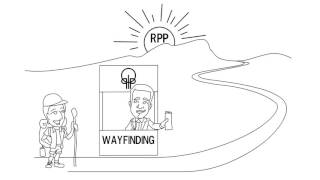
Things you should avoid developing your eLearning course
- Dylan Hedges
- Nov 17, 2020
- 2 min read
When developing eLearning there are a number of things you want to avoid to ensure your learners have an enjoyable and informative experience. When taking your course is important to ensure that your learners have a good experience so that they are able to effectively learn what you are trying to teach them.
Below are some of these things you should avoid when developing eLearning:
1. Messy Pages
When developing the User Interface for your eLearning course one of the key things to avoid is creating pages that are cluttered or confusing. Pages can become cluttered in a variety of ways, for example you may try to add a lot of text and images on a screen to explain a point, however the issue with this is that it can overwhelm the learner and can result in what you are trying to teach for that slide getting lost. When developing your pages try to be precise and to the point with what you are trying to say, do not overwhelm the learner and let them digest what they have learned.
2. Unclear Navigation
Another thing to avoid is having navigation that is unclear or confusing. At first it may seem obvious what the learner is suppose to click, however this is not always the case. When learners take your course they will all have a different approach and different levels of understanding when it comes to technology. When adding navigation elements to your page one of the main things is to try and be consistent, always have the Next or Previous buttons in the same place and always ensure that the buttons are in the same place, in addition to this always ensure that you test your navigation and check that it works as expected.
3. Not Being Consistent
Another thing that you should avoid is not applying consistency when designing your eLearning. When creating the pages for the course try to ensure you use the same colours throughout, if you style a button a specific way ensure that when the learner encounters the same button again that it has the same style and colour. Another thing to consider is when designing page layouts e.g. for a knowledge check page try to keep the same layout for other similar pages, as the learner takes the course they will become familiar with where on screen elements are, being able to easily work out what to press next will create a more enjoyable experience.
#customeLearningdevelopment #eLearningcustomdevelopmentsolutions #torontoelearningcompany #customelearningandtraining #elearningvendortoronto #customelearning #trainingcompanytoronto #torontoelearning #elearning #toronto #elearningcompany #elearningvendor #torontoelearningvendor


Comments