Modern UI trends for your eLearning

The UI or User Interface is the front-end of your eLearning, it is everything that the user can see on screen and is what they interact with. Some elements of UI design include choosing colour schemes, typography, layout and image placement. The UI is an important part of your eLearning as it determines how the learner sees your training and the type of experience they have. When developing your eLearning it is important that your courses have a clear, modern and responsive UI design to keep your learners engaged and interested in the content you are teaching them.
Below are some of the latest UI trends you can implement in your eLearning to keep it up-to-date and interesting for your learners.
1. Overlapping Text
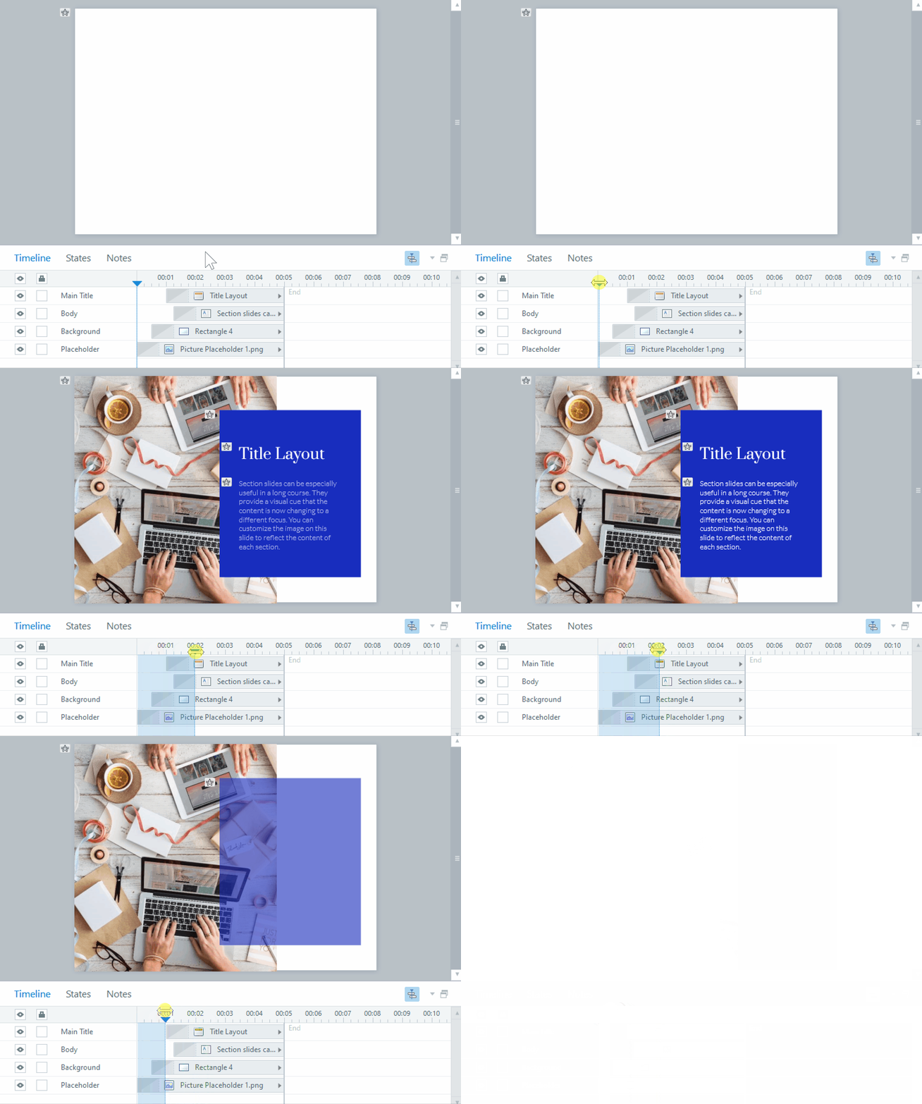
Overlapping text is a modern technique you can use to improve the UI of your eLearning. The concept of overlapping involves typically having white text that animates in over an on-screen image, you may have seen this commonly used in modern websites where the first page is a full screen image related to the website then shortly after white text will animate in, the user then scrolls down to view more content. This doesn’t just have to be used on the first page and doesn’t have to be a full screen image, you can use this technique on any image where you want to display a title or short sentence of text.
2. Attention Animations
As technology changes so has learners attention, now more than ever eLearning needs to keep the learners engaged and focused on what to do next. When on a small device like a tablet or smartphone it may be difficult to put instructions on-screen telling the user what to do next. Subtle animations such as a highlight, arrow or a change of colour can help achieve this. When working with a small screen space using attention animations can provide the ability to draw learners attention to the next thing without taking up to much valuable screen space.
3. Typography
Typography has become a key aspect of UI design, when used in combination with overlapping text a well suited typography can be the difference between modern looking eLearning an outdated course. One aspect of typography is the font, it is important that the font you choose matches the type of training you are creating and matches your companies brand. Another aspect of typography is the visual hierarchy, it is important that the right size fonts are used in the correct places, for example the title will be the largest font, followed by the subtitle which is slightly smaller and the main bulk of text being the smallest. Make sure you apply this when designing and developing the content for your next eLearning module.


